
When I first heard about REFUGE, I was on the tail-end of an incredible season of my life living in Whitefish, Montana, just under the shadow of Glacier National Park. The spectacle of these great peaks was the backdrop upon which I initially ideated the visual identity for the REFUGE brand.
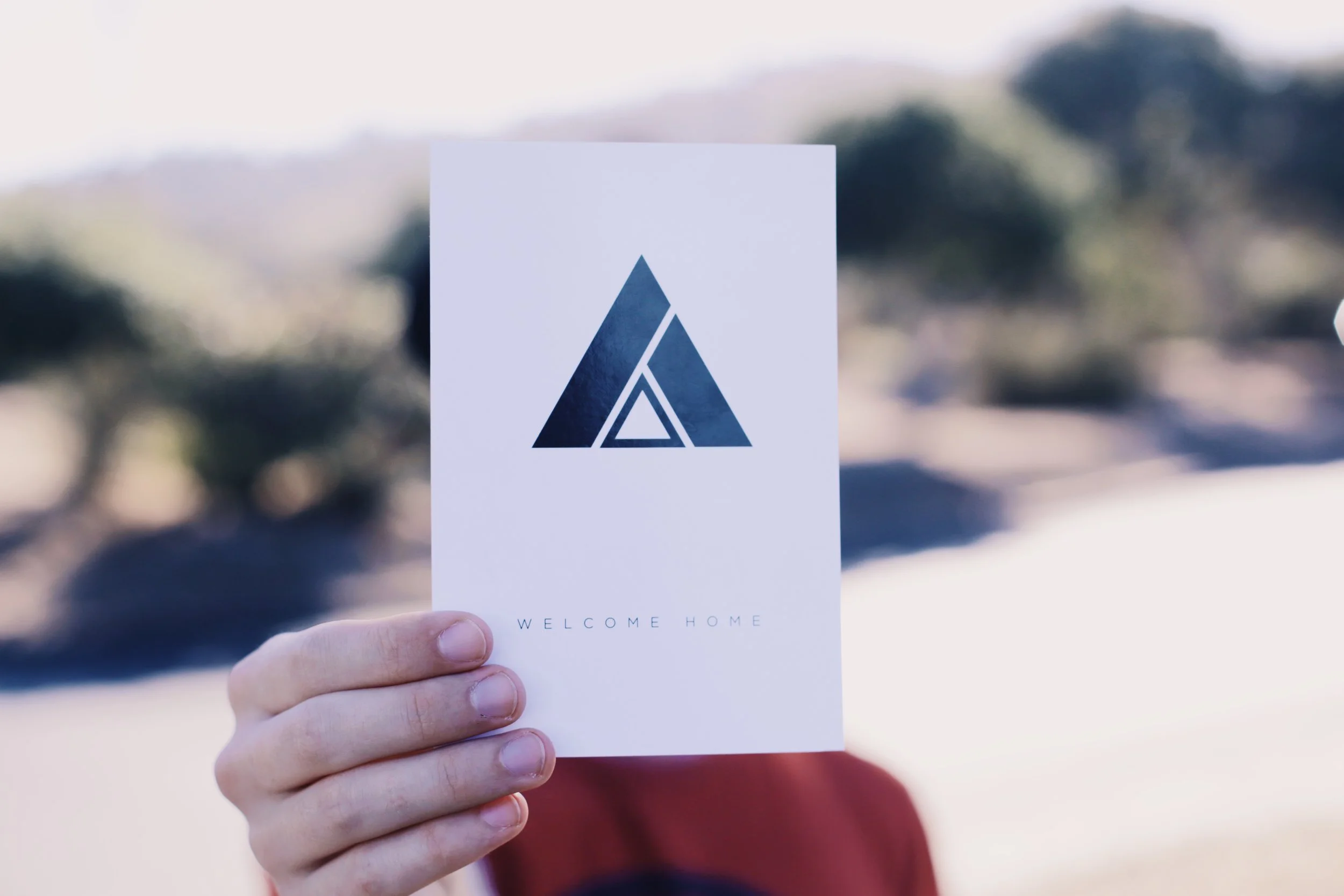
REFUGE's goal and mission were simple, "to see those lost find their home in Jesus Christ", and I knew anything I created needed to support that vision. Home.
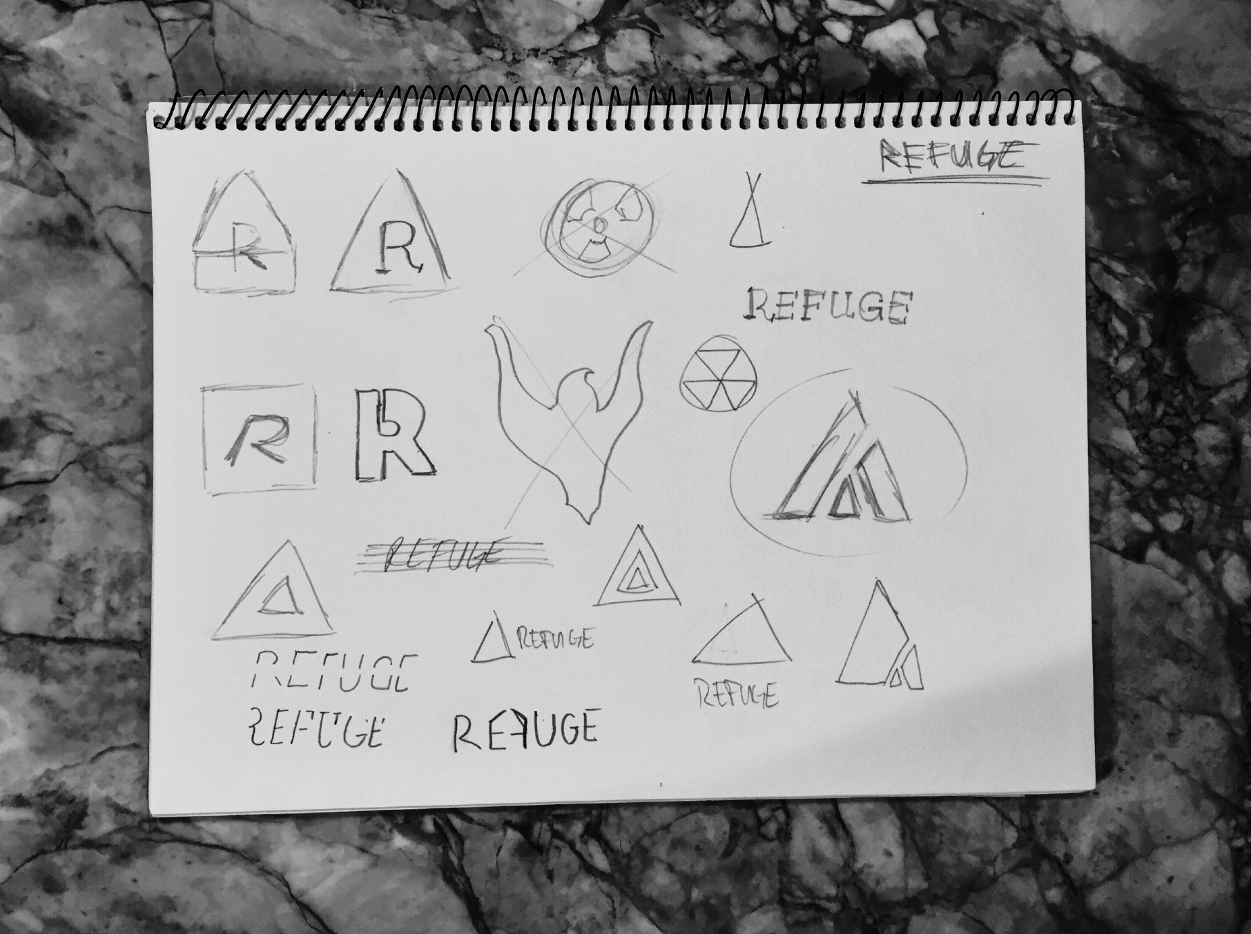
And so I took to my sketchbook. Scraps upon scribbles upon rips upon tears. Those preliminary sketches are some of the funniest, and most objectively bad things in the world of design. They hardly belonged in sketchbooks, a used napkin would have done just fine. It was important to set those ideas free; to get them out of my head and on to a page, or in the trash. Every project that starts humble, and human, starts well.
REFUGE was about creating home, and at that time my home in the mountains was teaching me a lot about the virtues of a good home: strength, simplicity, balance, security.
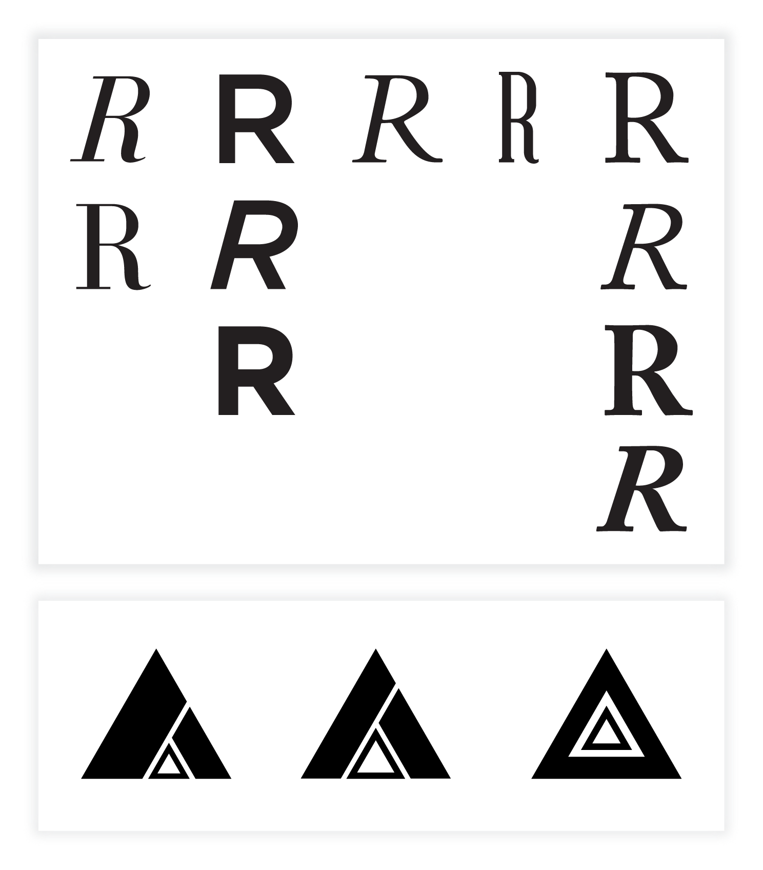
The fonts had to communicate strength, but not be sterile. I ultimately decided to steer away from a sans-serif for the headlining font, which wasn’t something most churches were doing at the time. REFUGE needed to be different. More human, more timeless, more home. The actual mark came together almost by itself.
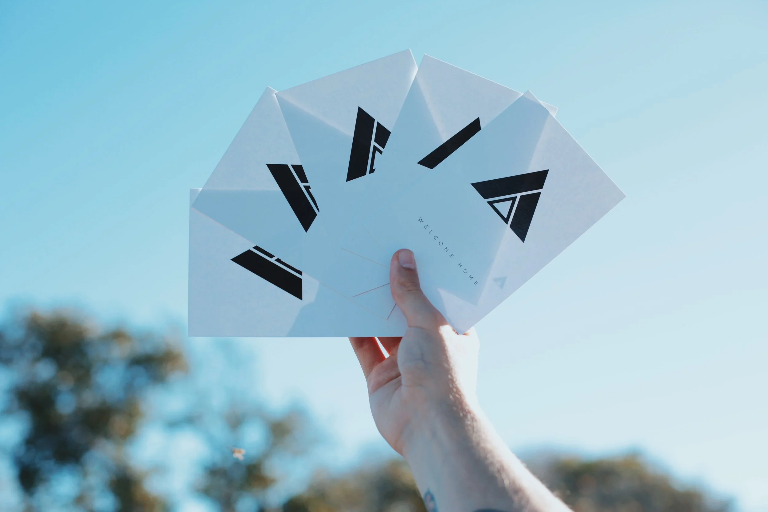
I had experimented with different shapes, it wasn't always the triangle. Circles, rectangles, and squares didn't do it for me here.
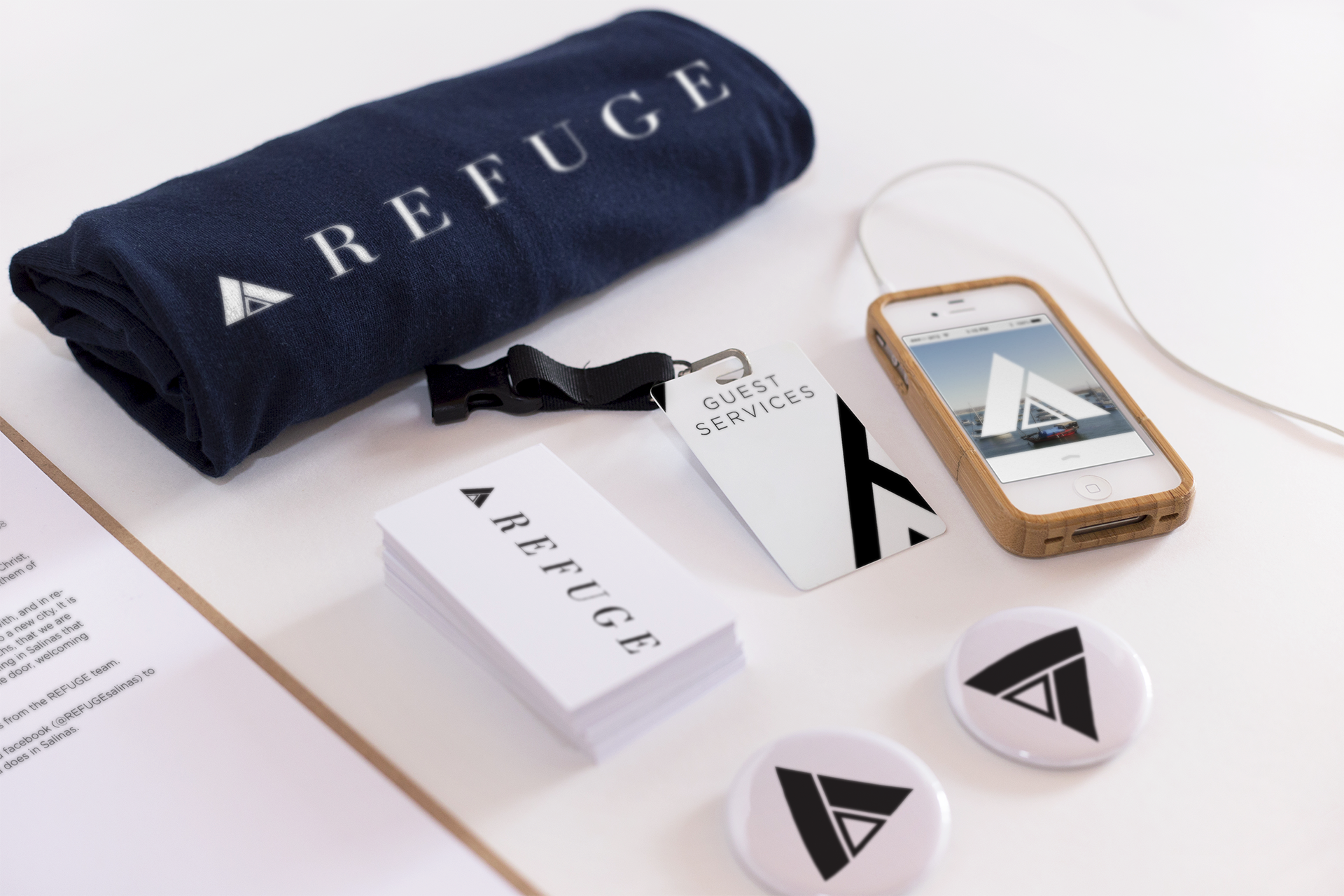
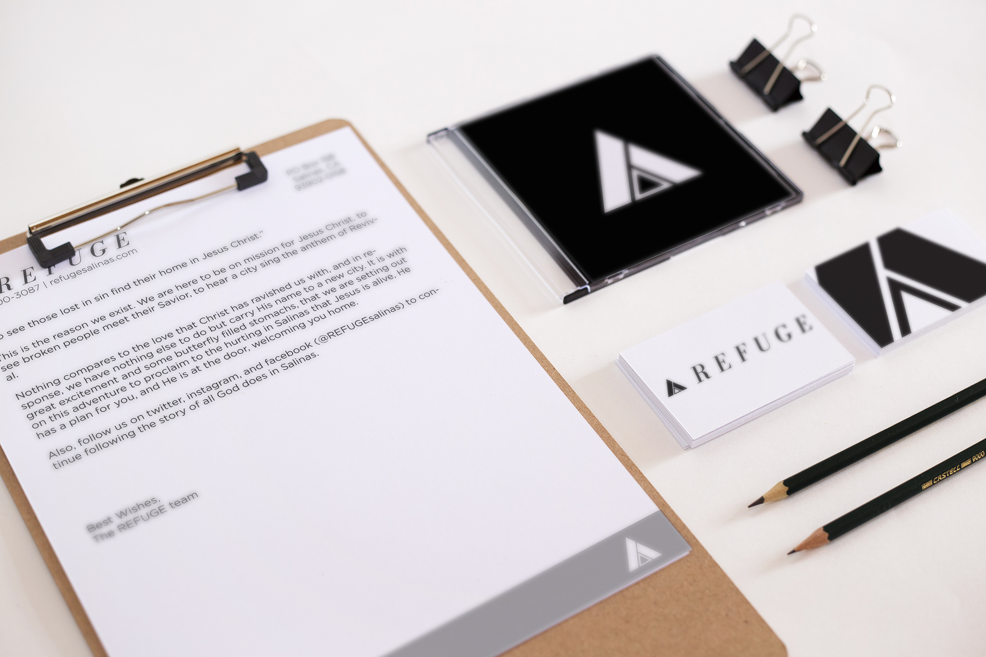
It was the equilateral triangle that combined the strength and stability of the square with the humanity and movement of the circle, and it's only perfect that the home, the strong mountain, the dwelling tent, naturally take the shape of the triangle as well. Of course, it didn't stop with a logo.
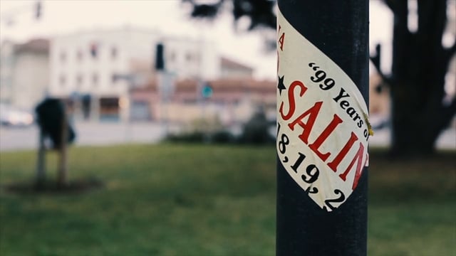
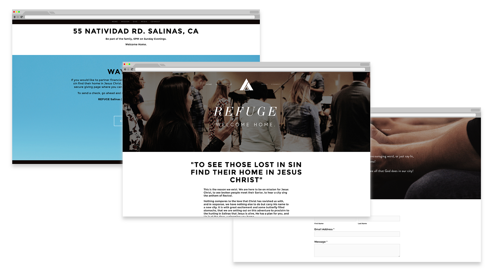
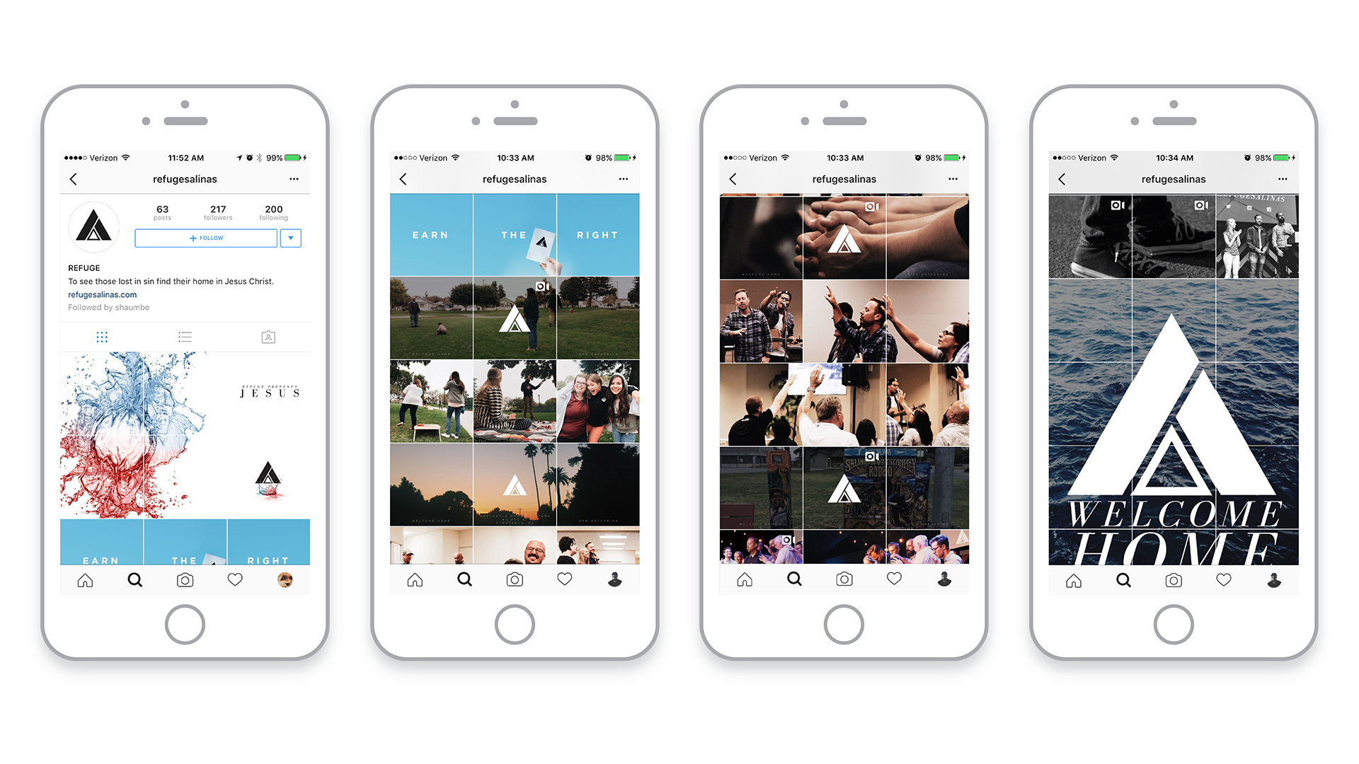
In order to start REFUGE on the right foot, I created a launch campaign that included a trailer, a website, print collateral, and a very intentional social media presence.
Working as the Creative Director for REFUGE was an incredible challenge, because we didn't have the manpower, we didn't have the budget, and often, we didn't have the gear.
At the time when we shot the trailer, I didn't have any audio or video gear, but I did have a friend with a little brother who had a Rebel t3i, and so I had a DP.
This was the nature of almost all of our projects, embrace limitation, be innovative, and be scrappy.
Art Direction, Design, Photography, and everything else by me.