Graphics package and branding for The Brandon Jamel Show.
Delivery included an intro, outro and an organized After Effects file that acts as a template with live text that the client can edit to make each episode unique.
Made with genuine analog conversion and capture techniques to make authentic broken VHS video and audio effects.
Here’s a more in depth look at how this was made.
A re-branding for Joel’s coffee roasting company. Started with a huge illustration for the bag and made a new logotype and website (plus all the imagery on the site).
To save $$$ and paper I developed a wrap-around label that can be used for both their 12oz bags and 5lb bulk bags. The color schemes for each label reference the flag of the coffee’s origin country, emphasizing the brand’s focus on single origin beans.
Additionally, the design system for the labels was created in Figma, which I coached the client on so that they can update details of their labels themselves and ensure the integrity of the system without my indefinite support.
I’ve also included here, as part of this case study, some notes from our initial phone call/brief as a sort-of obtuse look into my process.
Photos of the bags in the wild furnished by Dade City’s Postmen Coffee Co.
This is my wedding book, which I made for my wife for the christmas following our wedding. It functions as a memorial but also a record of the branding and art direction I did for the wedding, the printed matter, and the website. It’s full of masterful photos captured by Brandon Scott (custom wooden box also furnished by Brandon).
Brandon made it incredibly easy to compile and lay out. He captured a lot of great image sequences that made this project almost comic-like.
Special thanks to Matt Tinken for his meticulous notes which became the body copy of the book.
A digital reading experience can be accessed here and a .pdf is available here.
Selected e-mails, digital product modules, paid and organic social, and motion graphics designed for various DTC brands including Bravo Sierra and Daily Harvest.
Photos, video, and all asset copy furnished by each respective brands’ creative teams and business partners.
I’ve also included an example of what this work looks like in progress and the type of internal communication I facilitate to onboard non-designers to this workflow.
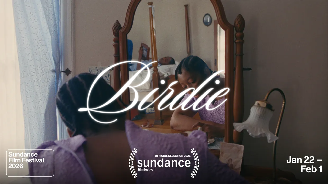
Title treatments for Praise Odigie Paige’s Birdie, which premiered at Sundance 2026.
3D assets for Jack Wagner’s Otherworld podcast’s video endeavors.
Original design by Cul De Sac Studio.
“legs” is a visual experiment combining stream of consciousness/word association, AI generated imagery, and mobile imaging tools.
Using a geographic prompt (in this case, the legs on Haight Street in San Francisco), I wrote a list of 50 words (some related to the legs, others related to the previous word).
Then using a Text-To-Image AI, I generated an image for each of these words.
Using the mobile app Glitché, I further abstracted these images.
Finally, using an image interpolation software, I sequenced the images in time based on their visual attributes in a way I predicted would result in an interesting motion output.
EDIT: at the time when I concieved and executed this project, AI generated imagery was far more primitive and my understanding of its ethical implications was not as advanced. I think I put this together in Fall 2021.
When I first heard about REFUGE, I was on the tail-end of an incredible season of my life living in Whitefish, Montana, just under the shadow of Glacier National Park. The spectacle of these great peaks was the backdrop upon which I initially ideated the visual identity for the REFUGE brand.
REFUGE's goal and mission were simple, "to see those lost find their home in Jesus Christ", and I knew anything I created needed to support that vision. Home.
And so I took to my sketchbook. Scraps upon scribbles upon rips upon tears. Those preliminary sketches are some of the funniest, and most objectively bad things in the world of design. They hardly belonged in sketchbooks, a used napkin would have done just fine. It was important to set those ideas free; to get them out of my head and on to a page, or in the trash. Every project that starts humble, and human, starts well.
REFUGE was about creating home, and at that time my home in the mountains was teaching me a lot about the virtues of a good home: strength, simplicity, balance, security.
The fonts had to communicate strength, but not be sterile. I ultimately decided to steer away from a sans-serif for the headlining font, which wasn’t something most churches were doing at the time. REFUGE needed to be different. More human, more timeless, more home. The actual mark came together almost by itself.
I had experimented with different shapes, it wasn't always the triangle. Circles, rectangles, and squares didn't do it for me here.
It was the equilateral triangle that combined the strength and stability of the square with the humanity and movement of the circle, and it's only perfect that the home, the strong mountain, the dwelling tent, naturally take the shape of the triangle as well. Of course, it didn't stop with a logo.
In order to start REFUGE on the right foot, I created a launch campaign that included a trailer, a website, print collateral, and a very intentional social media presence.
Working as the Creative Director for REFUGE was an incredible challenge, because we didn't have the manpower, we didn't have the budget, and often, we didn't have the gear.
At the time when we shot the trailer, I didn't have any audio or video gear, but I did have a friend with a little brother who had a Rebel t3i, and so I had a DP.
This was the nature of almost all of our projects, embrace limitation, be innovative, and be scrappy.
Art Direction, Design, Photography, and everything else by me.
UGC, Organic Social, Original Content™ — memes, collages, funny pictures, and other crap I made.
What is all this stuff doing here? What’s the significance of this garbage?
Do you really want to read a diatribe about how access to image making technologies has completely democratized visual culture in a way the art world’s gatekeepers may never fully recover from, and why it’s increasingly important for artists and designers to maintain vernacular literacy in order to produce effective work, communicate effectively on ever-evolving platforms, and navigate truly experimental spaces? FOHHHHHH
What if i told you I’m at least partially responsible for this tweet?
Well… I am, along with the other imagery here that I made for Adobe as a part of the creative team at Outcast. This work was featured in several cross-platform campaigns on various Adobe channels.
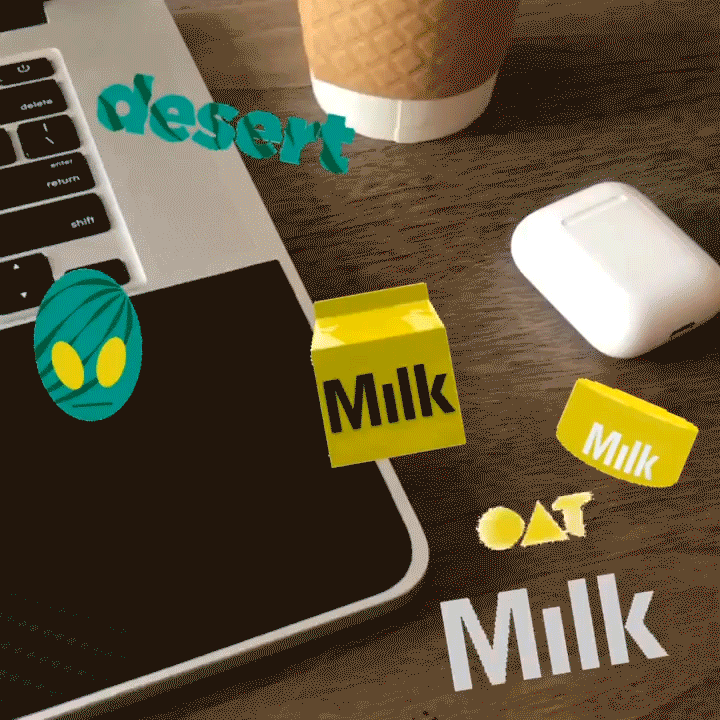
Another great collaboration with Garner Dumas: instagram stickers for Milk Makeup promoting Milk Vegan Moisturizer.
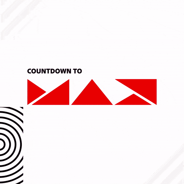
Social content for Adobe across their main brand, Gen Create, and Adobe Express social channels to promote Adobe MAX 2022. Made as a part of the creative team at Outcast.
Limited run t-shirt/sticker design for Eastlick Coffee Co.’s collaboration with Emo Night Tampa
Vinyl sleeve design for independent artist Jhariah Claire.
Another podcast with @joyseaboch this time.
The green screen would change for every episode - that art can be seen on instagram and twitter.
Editorial Design and Art Direction.
Redesign of Faithbox's Everyday Faith monthly devotional magazine.
The goal was to create a simple, approachable, sharable, and eloquent publication you would be proud to carry and delighted to read. The system was also applied to a mobile app and digital reading experience.
Selected Spreads.
I designed these free templates as part of an initiative by Adobe to create content for influencer partnerships and specific cultural moments while promoting their entry level product: Adobe Express. Made (using Adobe Express) with the team at Outcast.
Look, the only reason a cartoonist would include these last few projects in their portfolio would be to get you to say this:
“Wow! He has profound typography and page layout skills, as well as a refined ability to adapt to a brand voice and express its visual identity. It must be really hard to pay the bills with ‘mickey mouse donald duck batman rick and morty spiderman mario luigi wario lol’ I bet this guy is capable of taking his creative approach and making it work for the thing I need, even if it’s ‘normal’. I should give him lots and lots of money to do it.”
Album art for Faultycast, an art and cultural review podcast starring me and my guy Riley that ran from 2014-2016. Also some promo stuff we posted that surely didn’t annoy anyone.
You can find some episodes if you want - but I don’t care to make it easy for you. I mostly just care about you seeing the visuals.